From Complexity to Clarity: My Journey with Ant Design System
This blog explores how the Ant Design System streamlined collaboration between designers, product managers, and engineers in my client project. By creating a unified design language and consistent components, we aligned teams, reduced ambiguity, and delivered a cohesive user experience across the platform.
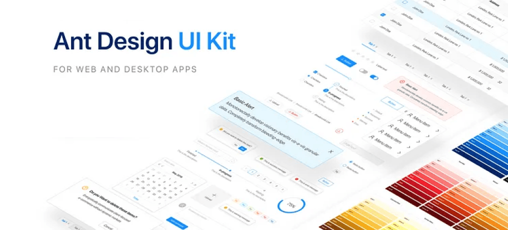
We introduced the Ant Design System into our client’s project at Cybage in 2023. Since then, the feedback from the client has been overwhelmingly positive and has provided valuable learning along the way. To save time and ensure reliability, we opted for a licensed design system from the official source. This system not only brought consistency across products but also improved team collaboration and onboarding. Here’s a closer look at how we implemented and scaled the Ant Design System.
The Problem
As client requirements evolved, we continuously added and modified features across their products. I realized the need for a reusable library to streamline enhancements and new developments.
Our initial approach led to a few key challenges:
Customer confusion — Inconsistent patterns caused uncertainty during similar actions.
Slower processes — Without reusable assets, designers and developers had to start from scratch.
Onboarding hurdles — New team members required extensive training, slowing integration.
The Big Question
How could we ensure a smooth, consistent experience for clients, designers, product managers, and developers? Should we build a design system from scratch, or adopt a ready-made solution from the official source?
The Solution
To support faster feature releases and keep development moving, we needed a ready-to-use design system so the client could focus on building, not reinventing. Here’s how I approached it:
Audited the existing UI inventory
Reviewed the old color palette
Collected the client’s brand guidelines
Adapted and managed the Ant Design System
Deep-dived into tokenization, variables, colors, and typography in Ant design system
Documented and applied updates based on client feedback and brand standards
The Process
1. Audited the existing UI inventory
I started by reviewing existing design files and the older developed platform to understand what was already in place. I gathered components like typography, colors, layouts, modals, and more. This helped me identify overlaps, one-off components that didn’t need inclusion, and inconsistencies—especially in color usage. I documented everything in one place to create a clear starting point.
2. Reviewing the Old Color Palette
After the UI audit, I compiled a basic style guide covering colors, typography, icons, spacing, shadows, and layouts. This helped me quickly spot inconsistencies in component styles and understand where updates were needed.
3. Collected the client’s brand guidelines
I gathered the client’s existing color palette from the developed product and aligned it with their brand guidelines. While brand guidelines typically define primary colors like Red, Blue, or Black, UI design demands multiple tints for practical use.
Using the ANT Color Generator tool (also used by developers), we scaled each color from 1 to 10, with Tint 6 as the base to ensure consistency. All colors were validated as per WCAG 2.0 accessibility standards and organized into primary and secondary groups, ensuring a scalable, accessible, and developer-friendly color system.
4. Adapted and Managed the ANT Design System
Since we purchased the ANT Design System to save time, I began integrating the client’s brand colors into it. I customized the system by adding our color palette, making necessary adjustments for accessibility, and refining other design specs like shadows, timelines, and components. This ensured the design system aligned seamlessly with the client’s brand while supporting usability and consistency.
5. Explored Tokenization, Variables, Colors & Typography in ANT
This was a new learning curve for me. Although ANT Design came with built-in tokens and variables, I needed to customize them to match our style guide. To do that effectively, I deep-dived into understanding how tokens, variables, and components are interconnected, ensuring precise and consistent updates across the system.
This is how I brought together a unified, consistent, and easily maintainable design system that aligns teams and elevates the user experience.
What's Next ?
Updating a design system is an ongoing process. As new products and features roll out, the system evolves with optimized versions. I continually update the design system with new components, icons, color palettes, and variables, while also documenting changes in JIRA for future reference and to support other designers.